Bringing awareness to financial products through recommendations
The Problem
Customers aren’t aware that Kroger offers financial products and services such as credit cards, gift cards, and Kroger pay. And they aren’t aware of how much money they could save with these products and services.
Project Goals
Bring visibility to these products and services while and make it easy to understand the savings tied to them
Aim to also increase revenue for the company by enrolling more customers in these products and services
My Role
Lead product designer
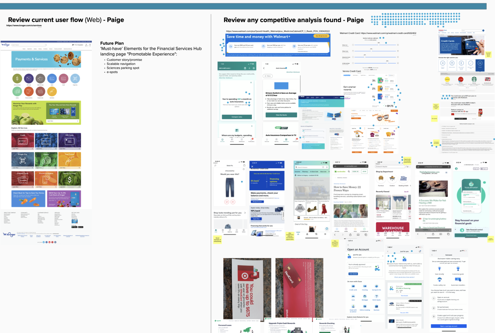
Conduct secondary research
Partner with the research team to conduct surveys
Create product UI
Design Process & Project Partners
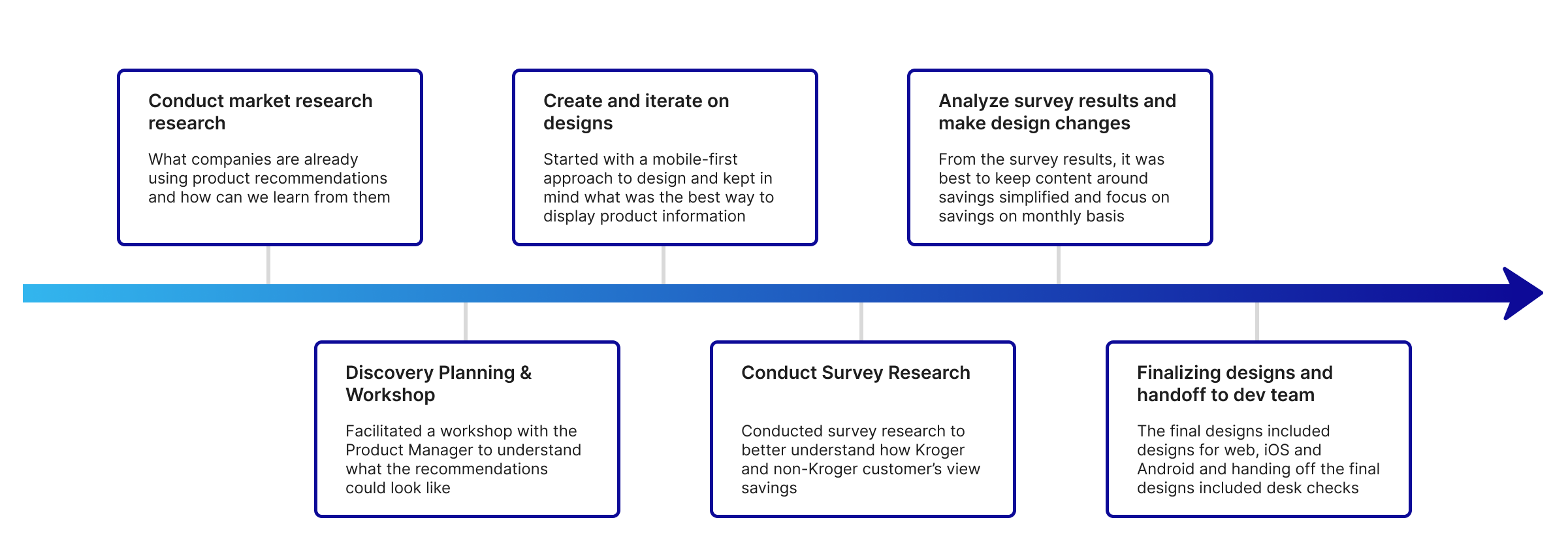
For this project I worked closely with the product manager, development team, UX writing, data scientists, and marketing. This is an outline of the process and the project took roughly four months to complete.
Discovery Planning & Workshop
The goal with discovery for product recommendations was to think about how might we … I collaborated with the PM to go through the discovery activities with our development team.
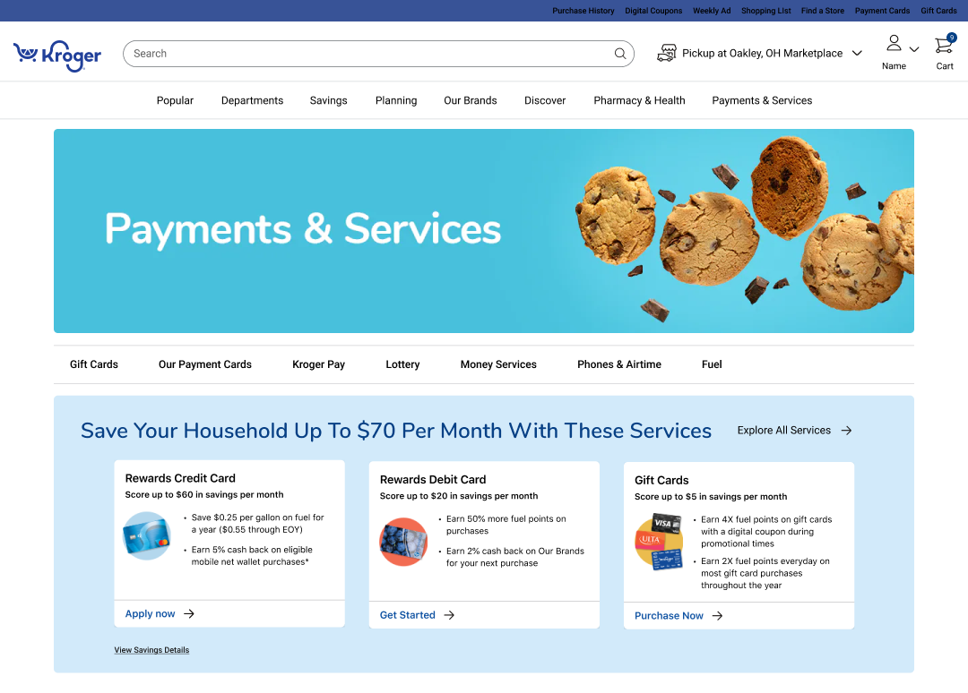
Initial Designs
Because a large focus of this project was showing content for individual payment and services, having a mobile first design was critical. Enough text had to be shown to help customers get an idea of how they could save with the product.
Bringing in project partners such as UX writing and Marketing was important in helping make sure the messaging and content was on brand and concise.
Survey Research
One of the bigger questions for this project was how might we show customers savings in a way that will make sense for them and their spending habits. This research method was chosen because it allowed our team to collect real data from many customers and helped us understand the main research question below within the project timeline:
Would customers understand seeing all savings (or stacked savings) in the title for all product recommendations?
Survey participants:
46 Kroger customers
56 non-Kroger customers
Incorporating Research Findings with Designs
Impacts of research:
Found it best not to show a stacked savings from all of the recommended products since it wasn’t easily understood by most customers
Showing product savings on an individual basis was best
Showing a savings on a per month basis was also best since over half of participants manage their budget on a monthly basis
Final Designs
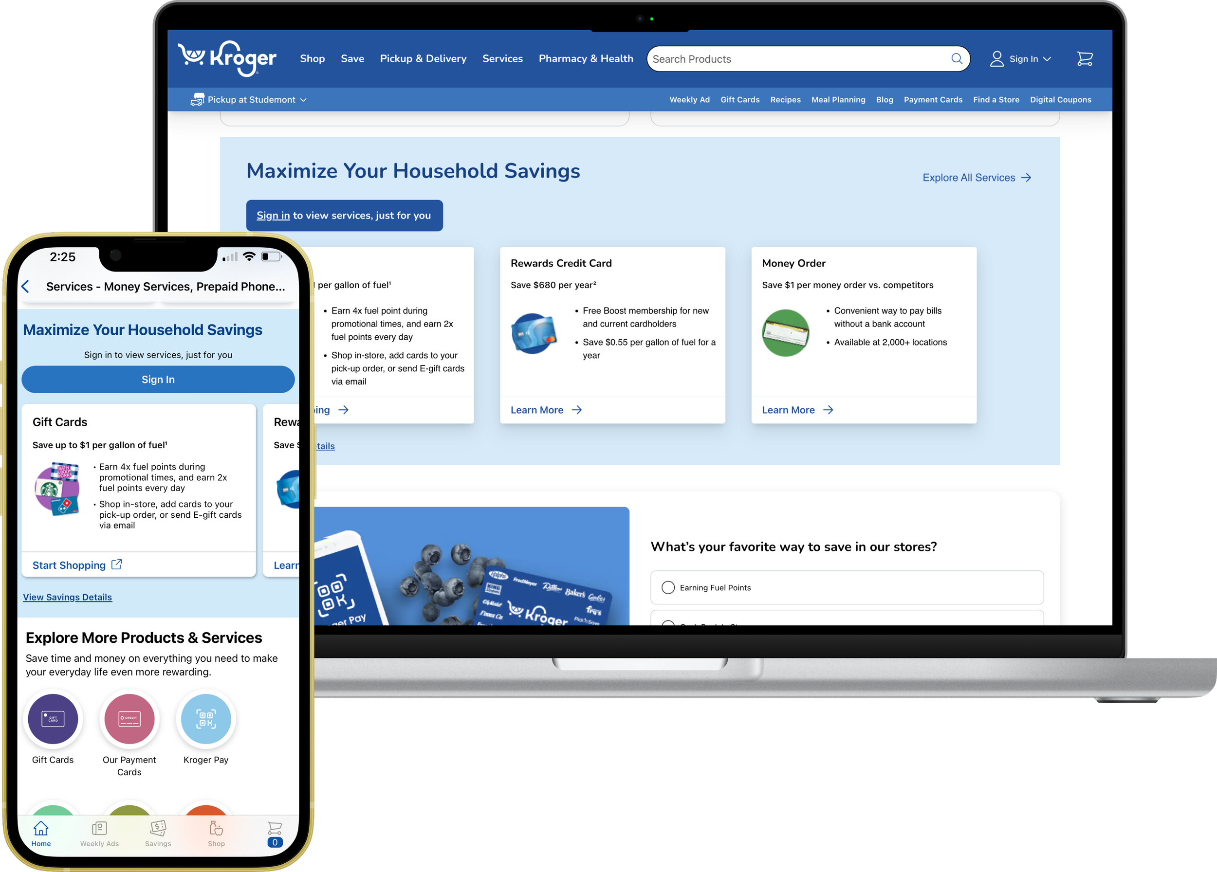
The final designs include designing for iOS, Android, mobile web and desktop. There were many iterations of the designs that built upon each other. The initial design did not include any product savings and over time the team was able to develop a way to show savings based on individual household.
Sign In to View Savings
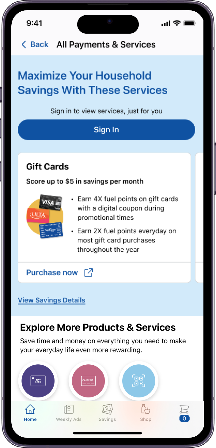
This is the not logged in user experience for iOS. The call to action is for the customer to sign in.
The call to action is near the top to encourage customers to sign in to get a more personalized savings.
Copy was an important aspect of the design because we wanted it to feel like these are personalized savings.
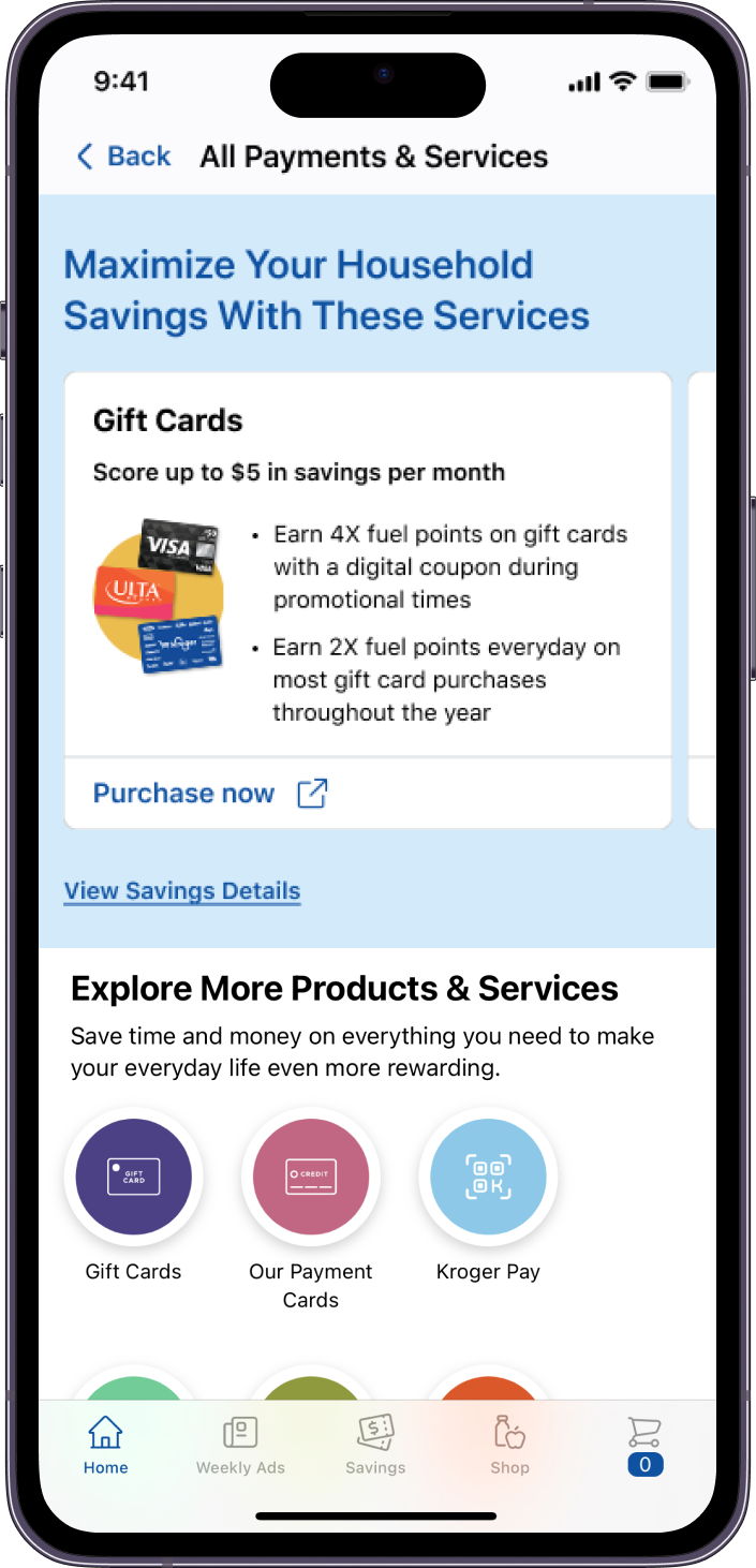
Product Card Design
Much thought was put into the card design since there wasn’t a component for this in the design system.
There was balance between showing content, and image for the product and having a way for the customer to learn more about the product- which is the link for the product page.
Outcomes & Learnings
This tool is currently in the Kroger app and on the website in the Payments and Services section of Kroger. One challenge of this project was to balance the interests of the business with the feasibility of the design. If I had more time to spend on this project I would conduct user testing to further refine the designs.

