
Personalizing product savings for customers
Background
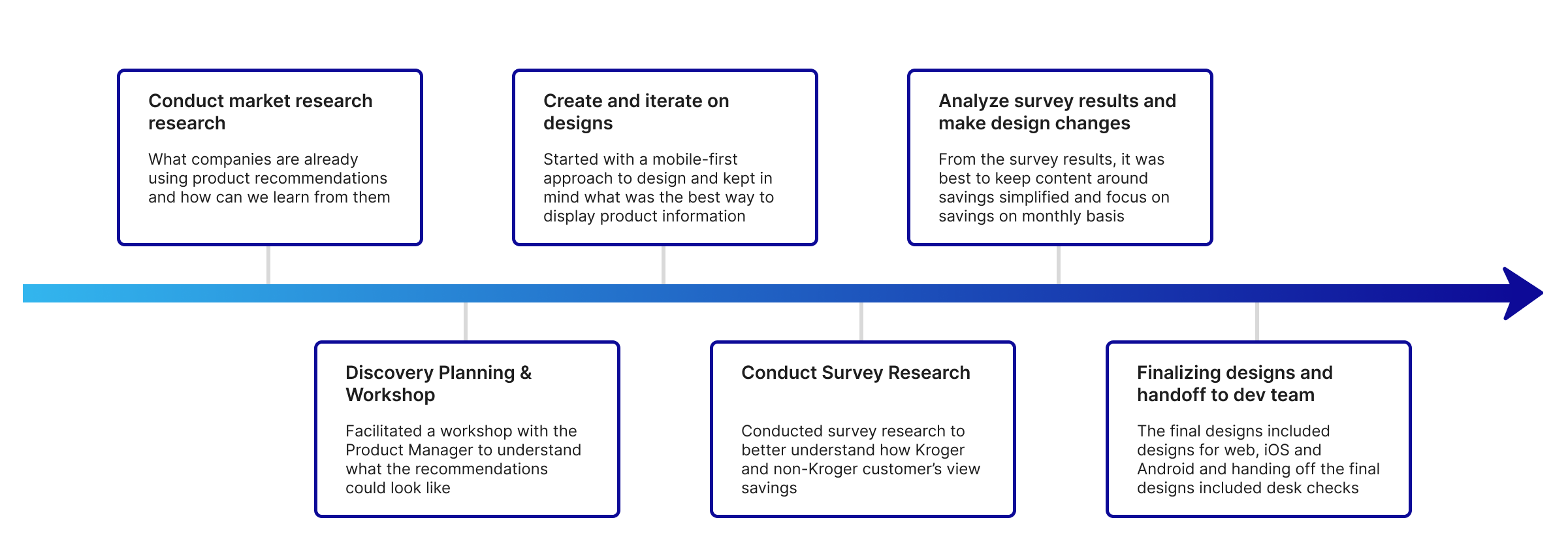
Methods: UI & UX design, workshop and survey
Timeline: 4 months
Tools: Figma
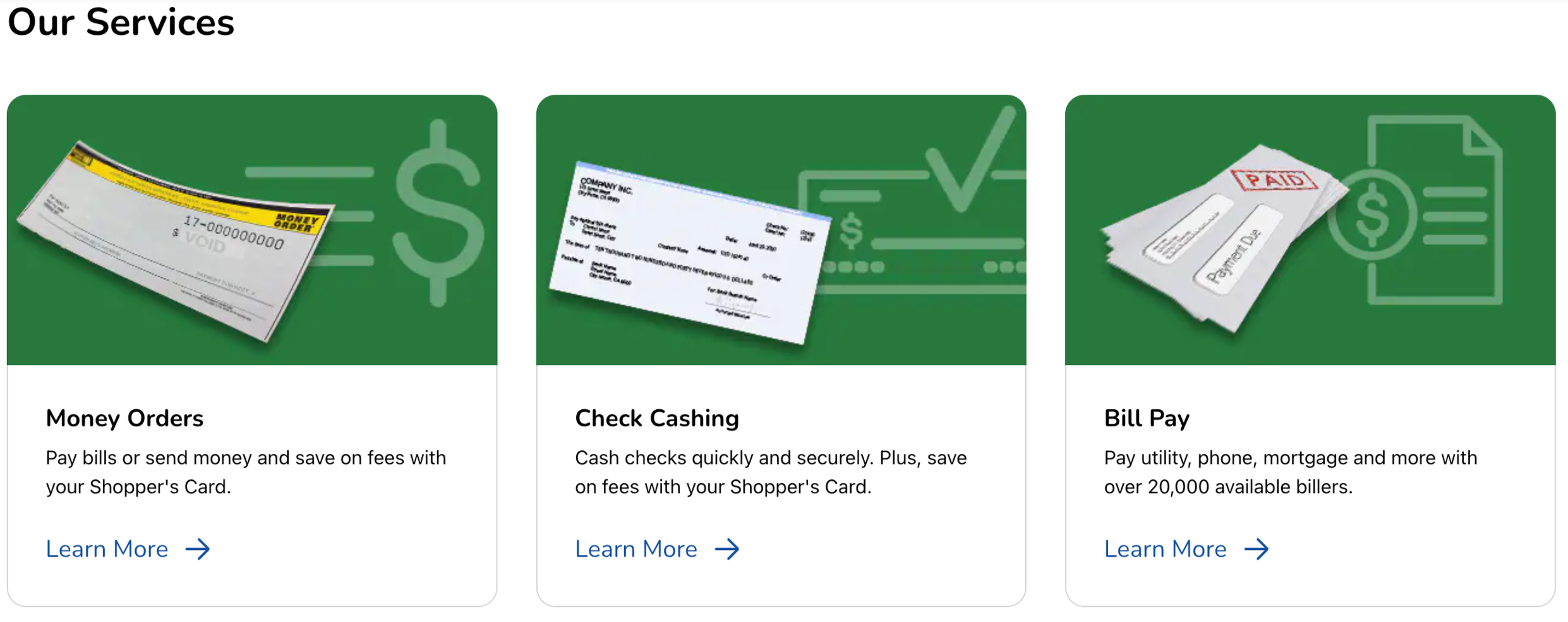
Outside of offering groceries, Kroger offers a variety of products and financial services, often done through third parties. Some of these include offerings like money orders, check cashing, money transfers, gift cards, and credit card.
The problem: Lack of customer awareness about payments & services products.
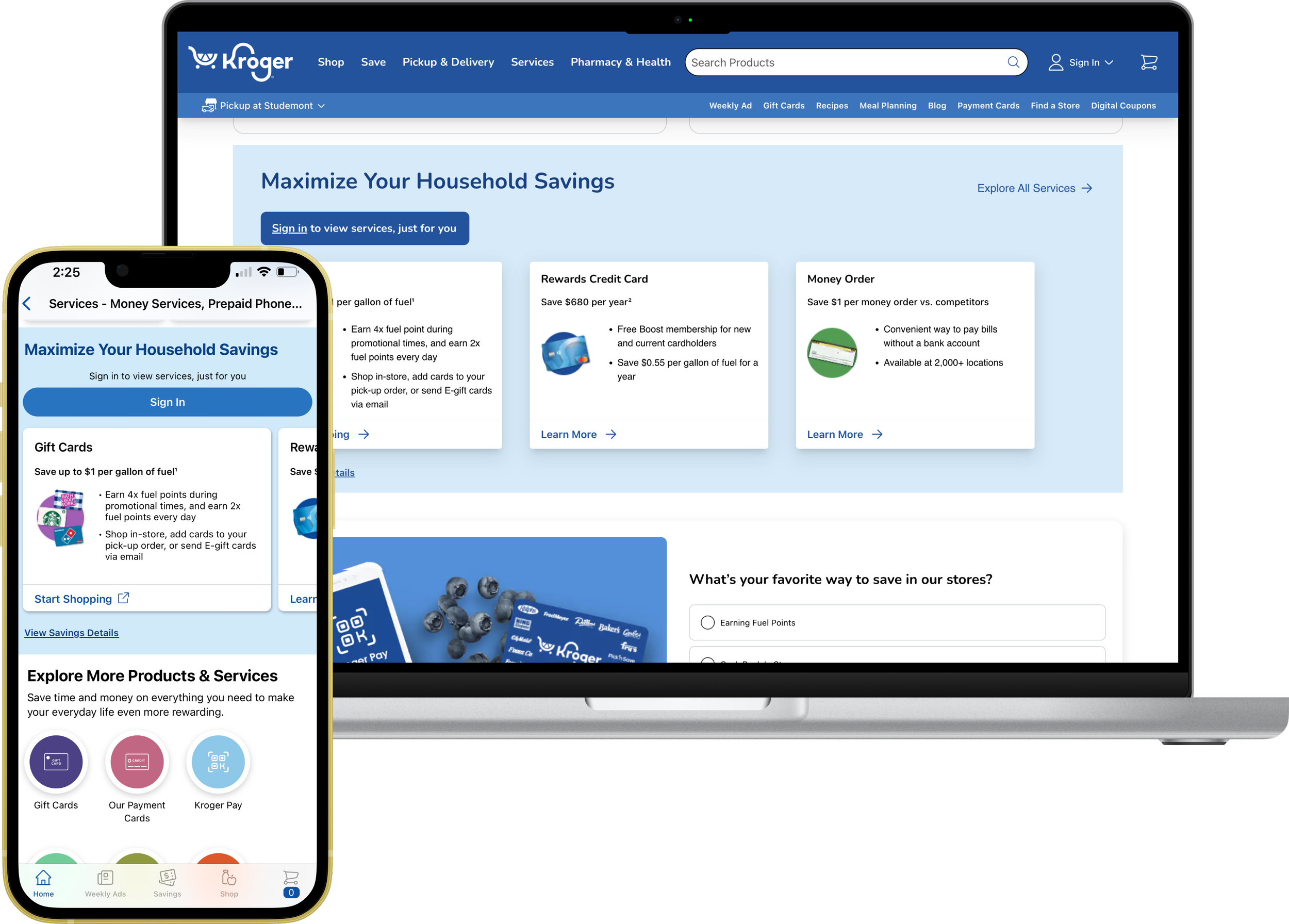
Customers aren’t aware that Kroger offers financial products and services such as credit cards, gift cards, and Kroger pay. And they aren’t aware of how much money they could save with these products and services.
Project goals
Bring visibility to these products and services while and make it easy to understand the savings tied to them
Aim to also increase revenue for the company by enrolling more customers in these products and services
Design process overview
For this project I worked closely with the product manager, development team, UX writing, data scientists, and marketing. Below is an overview of the design process.
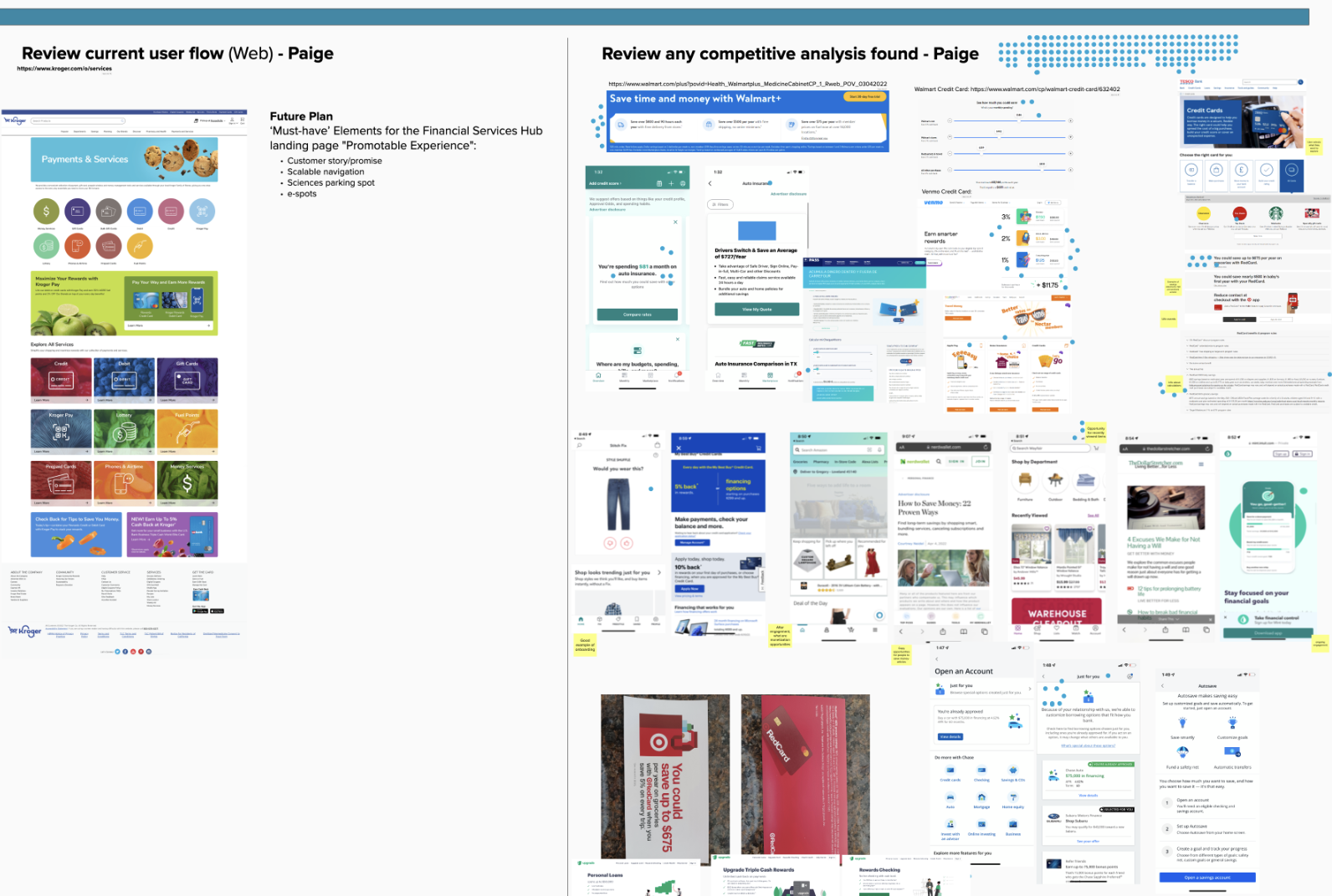
What does the product recommendation landscape look like?
I collaborated with the PM to facilitate a series of discovery activities and in one of these activities our team gather images of other tools with product recommendations.
Content design challenges
Because a large focus of this project was showing content for individual payment and services, having a mobile first design was critical. Enough text had to be shown to help customers get an idea of how they could save with the product.
Bringing in project partners such as UX writing and Marketing was important in helping make sure the messaging and content was on brand and concise.

How can we show customers savings in a way that will make sense for them and their spending habits?
The business wanted to understand if customers valued seeing savings across all products or savings from individual products. In partnership wit the research team, we surveyed 46 Kroger customers and 56 non-Kroger customers.
From a research perspective, we also wanted to understanding how customers budget, whether it was by month or another timeframe.
This is an example of showing the total of savings across products.
Research impacts & final designs
The final designs include designing for iOS, Android, mobile web and desktop. There were many iterations of the designs that built upon each other. The initial design did not include any product savings and over time the team was able to develop a way to show savings based on individual household.
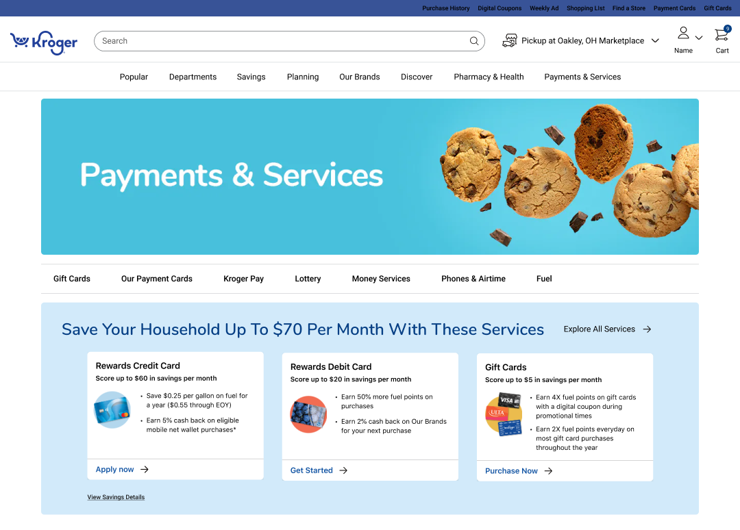
Logged-out experience
With a logged out user experience, I included a Sign-In button and UX writing provided copy to encourage people to sign in so they would get a more personalized experience.
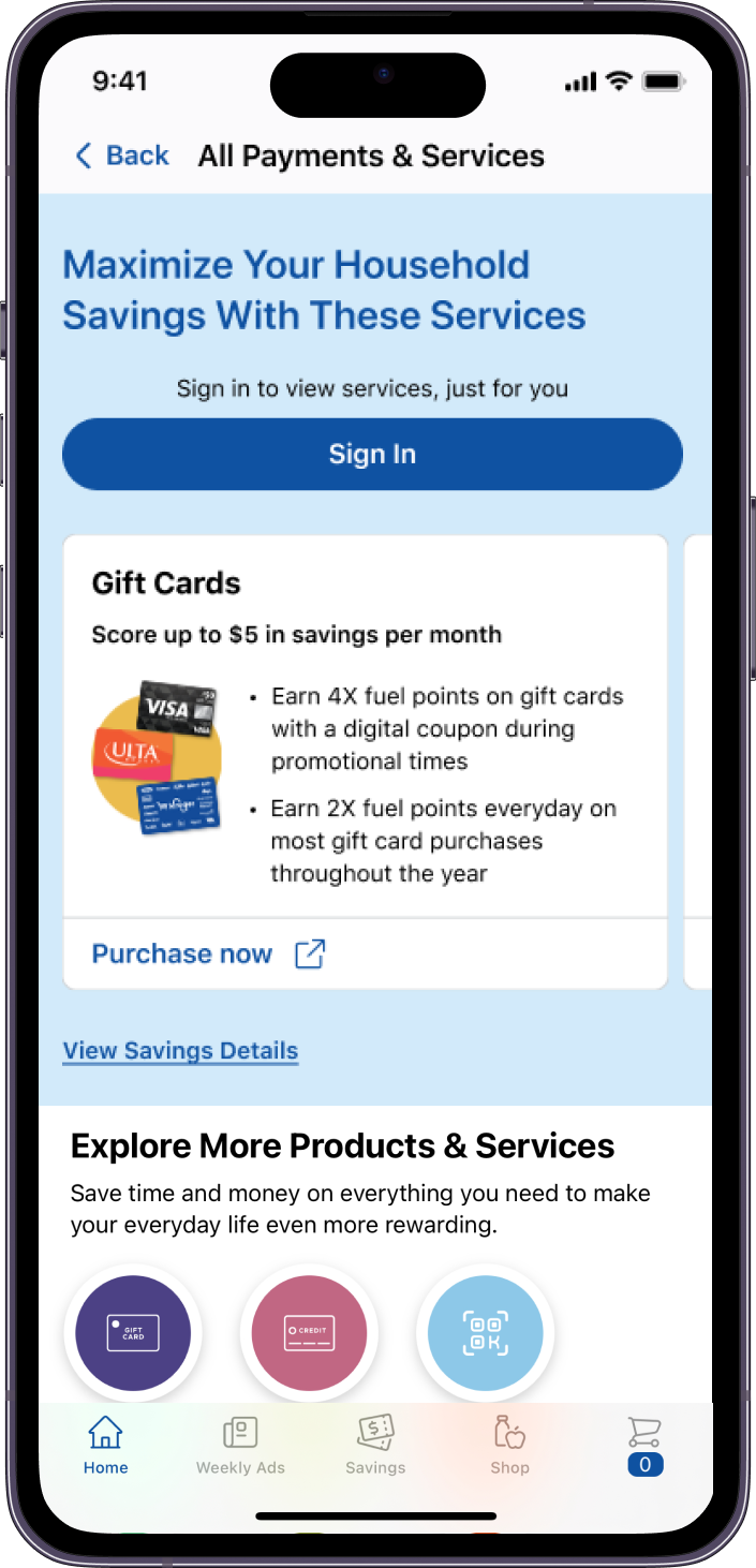
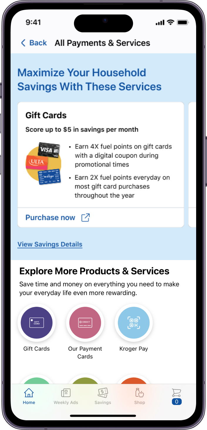
Product savings
Survey research showed it was best not to show a total product savings, since it wasn’t easily understood by most customers.
We also learned from the survey, showing a savings on a per month basis was also best since over half of participants manage their budget on a monthly basis
Card design
A custom card component was created to accommodate the product layout.
Outcomes & learnings
This tool was in the Kroger app and previously on the website in the Payments and Services section of Kroger. It was also launched in 18 affiliated Kroger owned brand sites.
One challenge of this project was balancing business requests with the feasibility of the design. If I had more time to spend on this project I would conduct user testing to further refine the designs.