
Bringing visibility to staffing data
Background
Methods: UI & UX design, conversation design
Timeline: 4 months
Tools: Figma and Microsoft Copilot
Sage is a virtual assistant designed to help Kroger employees access HR-related information and workflows. I worked on expanding Sage to support employees picking up shifts at other stores, via a marketplace, and for HR leaders and managers to be able to view this staffing data within stores and districts (group of stores).
Project goals
1. Enable employees to work from other locations and select shifts from a marketplace
2. Create a way for shift data to be accessible to managers
3. Enable managers to approve shifts and remove shifts
Above are a few of the project goals and this case study focuses on the second goal.
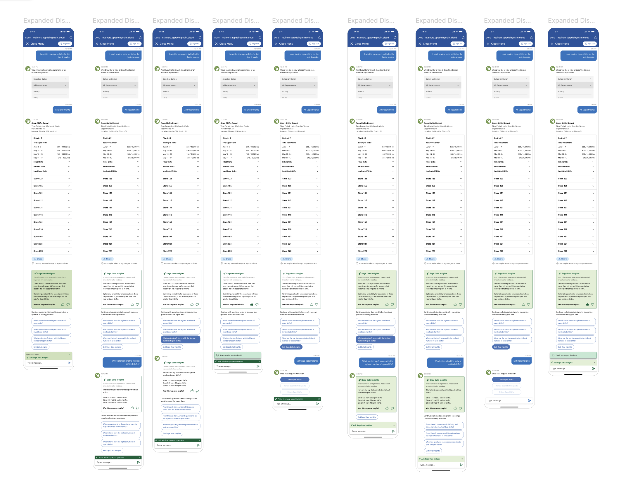
The problem: How to present a large amount of staffing data in a meaningful way.
With the newly created market place for shifts, this provided the opportunity for HR & store leaders to see past and present data about shifts in their own stores or by district (group of stores).
The data that needed to be presented had many layers. For example, within a store you can see an overview of how many shifts are filled or unfilled. Within that same store you can also drill further down to drill data by department.
Collaborative workshops
The project kicked off with workshops with stakeholders and the 3rd party development team, where detailed workflows were mapped out.
As a designer, I worked closely with the Product Manager and Lead Product Designer to ensure designs captured business requirements.
Findability & conversation design
When creating UX for a virtual assistant, one of the main focuses is on language and how leaders access each workflow. With this tool, depending on the workflow, managers can access the data they need to by go through a main menu or typing in a utterance (eg. a phrase such as “I want to view unfilled shifts”).
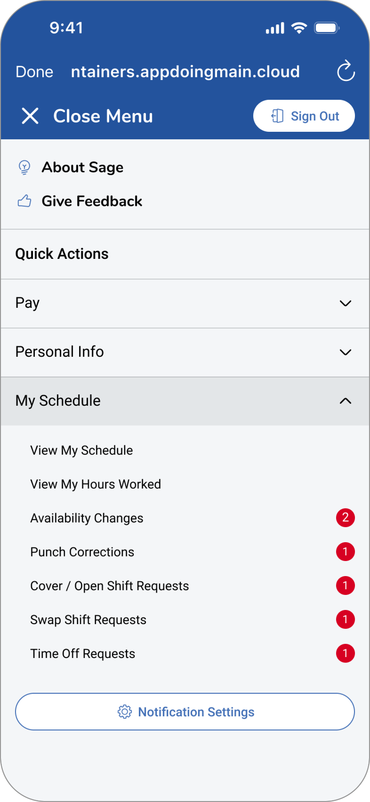
Main menu
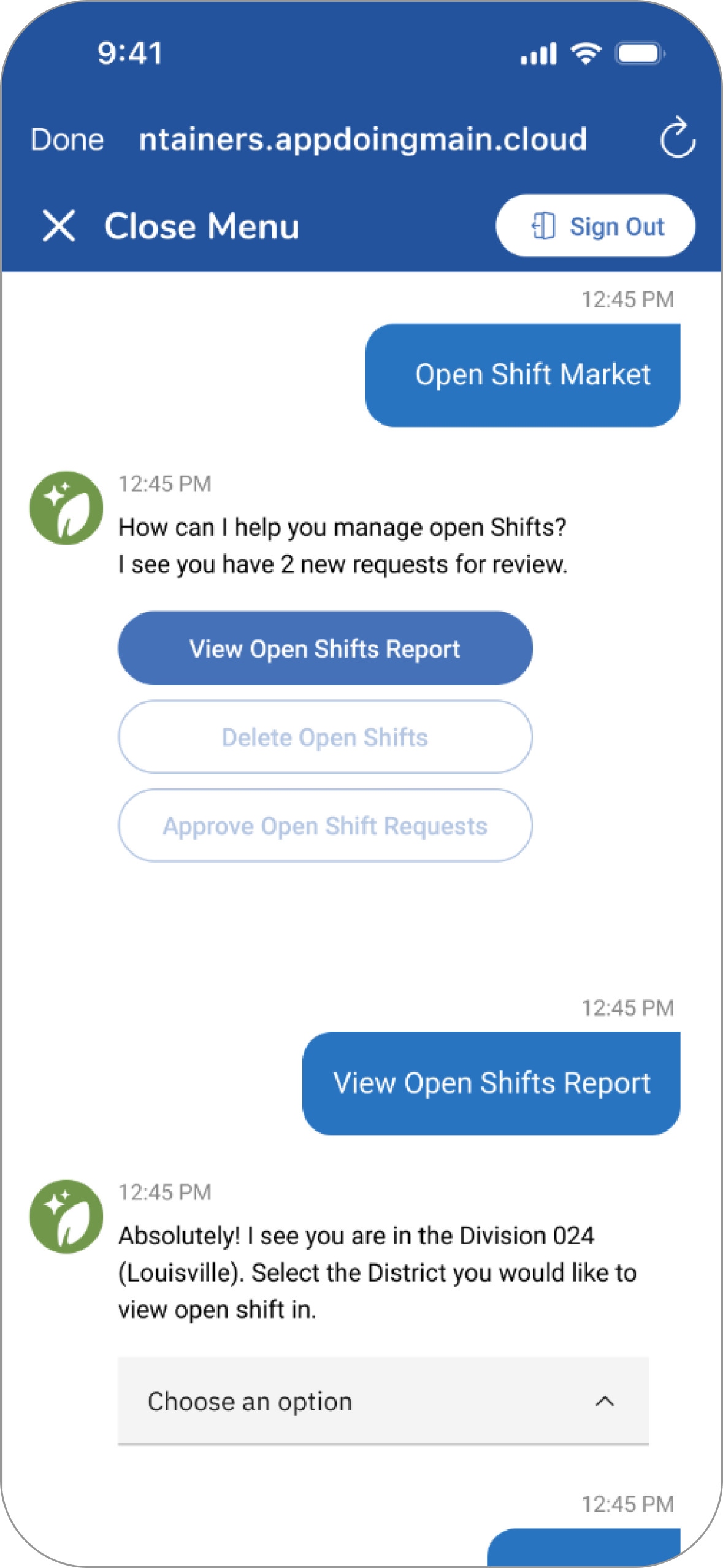
District Workflow
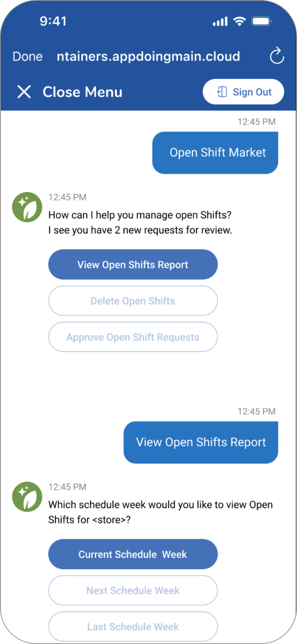
Store Leader Workflow
Design, an iterative approach
To be able to build in data views with an AI summary component, our team worked incrementally to build on the initial designs.
This started with designing a district and store level view of the data. I utilized existing data template to endure design consistency. My focus was building a view of the current week data.

Challenges with data loading
During the build process there were challenges with high load times for the data. Our design team worked closely with the development team to understand what designs were possible to address this issue.
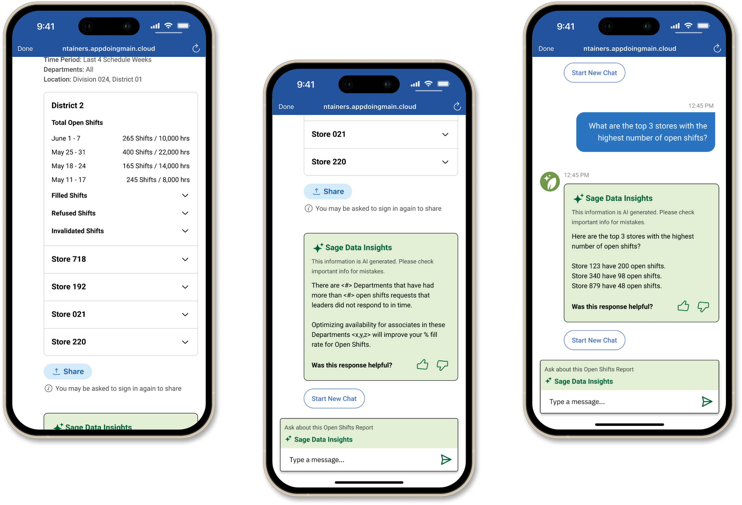
Highlights of store data views
Store managers and HR leaders will be able to take an in depth look at important items like what shifts are pending approval, what shifts are unfilled, and what shifts employees are requesting to be covered. These data views are responsive and also available on desktop.
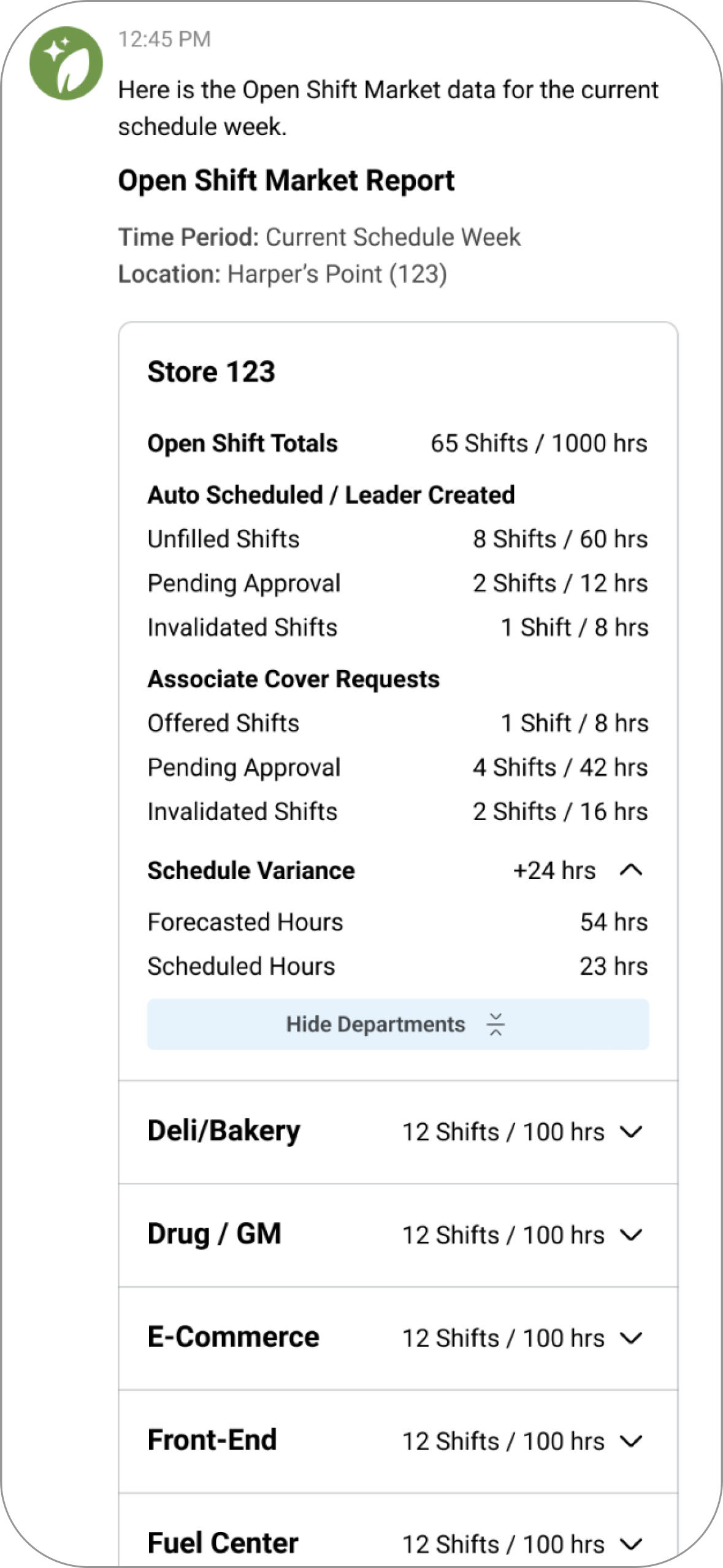
Summary Store View

Department View
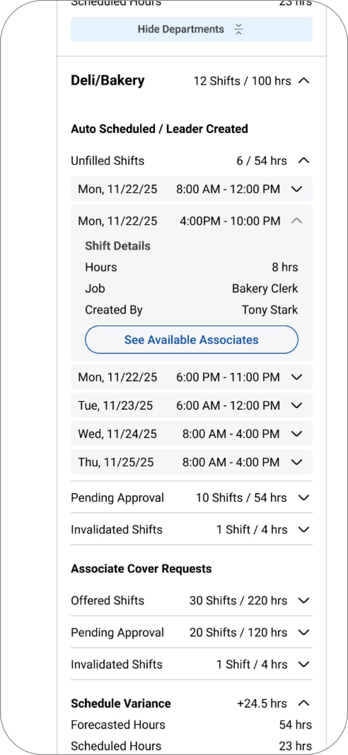
Department View Expanded
Shift to an AI-insights focus
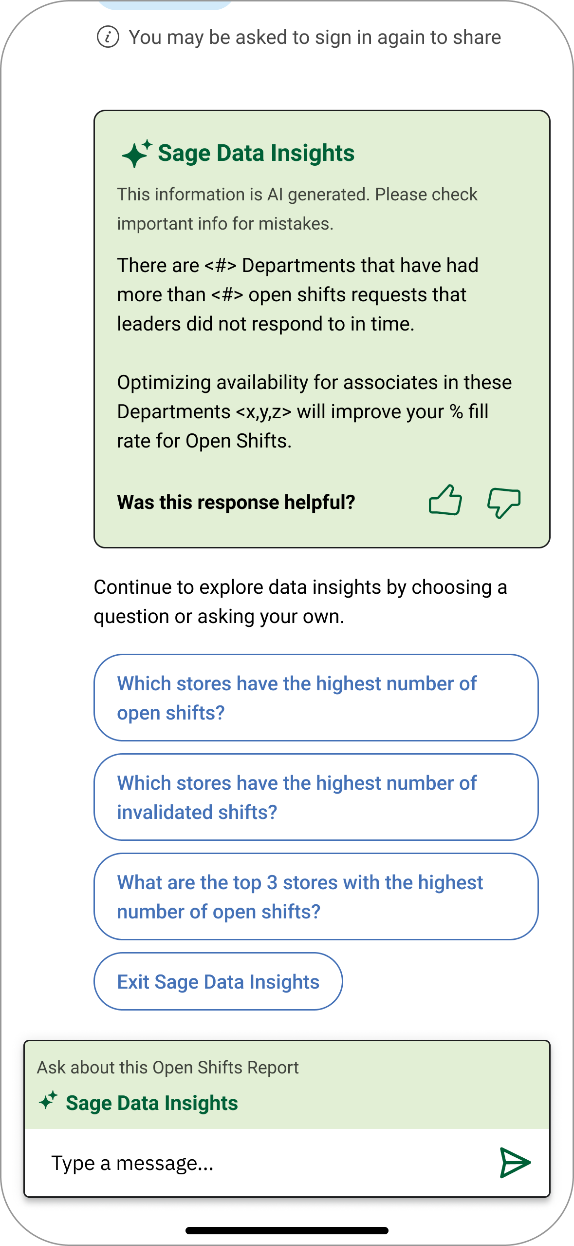
With the initial data views built and aligned with the business, we then incorporated an AI component that would use the report data and pull out key insights about staffing.
We had meetings with the development team to brainstorm and understand the various AI inferences.
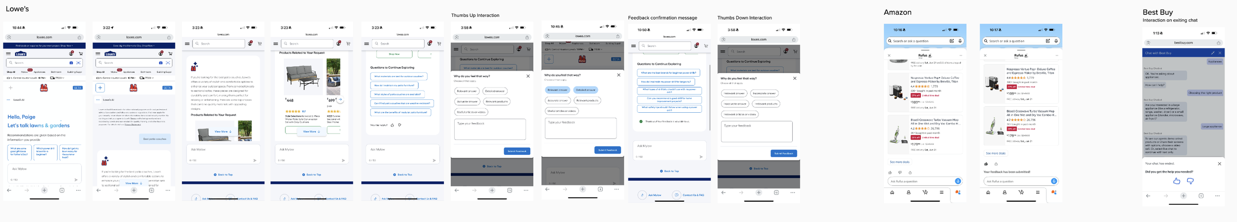
I gathered inspiration to see how other company’s AI chatbots functioned and what the feedback (thumbs up and thumbs down) experience was like.
How might we make the AI experience feel connected to reporting?
One of the biggest challenges with working with a separate AI technology was showing marketplace report and letting users know that when they asked a follow up question about the data, they are now engaging with the AI component of Sage. The follow up response to the new question would then be presented in the AI-insights component.
Design iterations
Idea: Present follow up questions about the data to let the user know they are now engaging with the AI part of the tool.
Idea: Have the chat input field include text to express it’s connected to Sage Data Insights.
Idea: Use color to connect the AI insights with the chat box to let users know they are now engaging with AI insights.
Design iterations incorporating the AI data insights.
Simplifying the approach
Instead of including follow up questions in the designs, our team felt like it was best to go with a simplified approach and align with stakeholders on the designs. We also didn’t know if the AI tool would be able to surface the follow up questions we had initially wanted.
With this approach, we could add follow up questions later on if the stakeholders align on it and it can be supported by the technology.
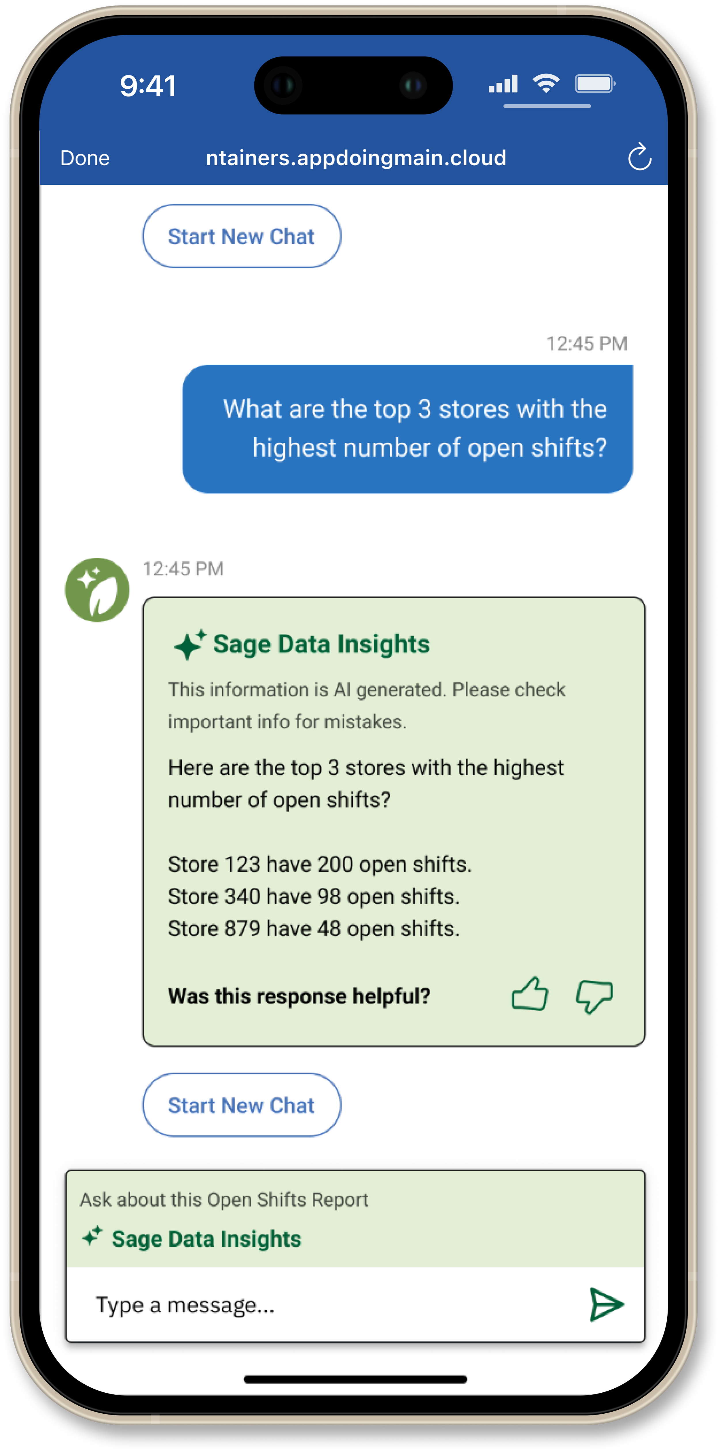
Chat input field design
To connect the chat input field to the Sage Data Insights we are using color and text to signal to the user that they can ask follow up questions about the data.

Follow-up questions
When leaders ask a follow up question about the report above the answer will continue to appear in the Sage Data Insights component and the matching text box will remain.
User feedback on the AI response
HR & store Leaders also have the opportunity to provide feedback on the AI response and indicate whether it was helpful.
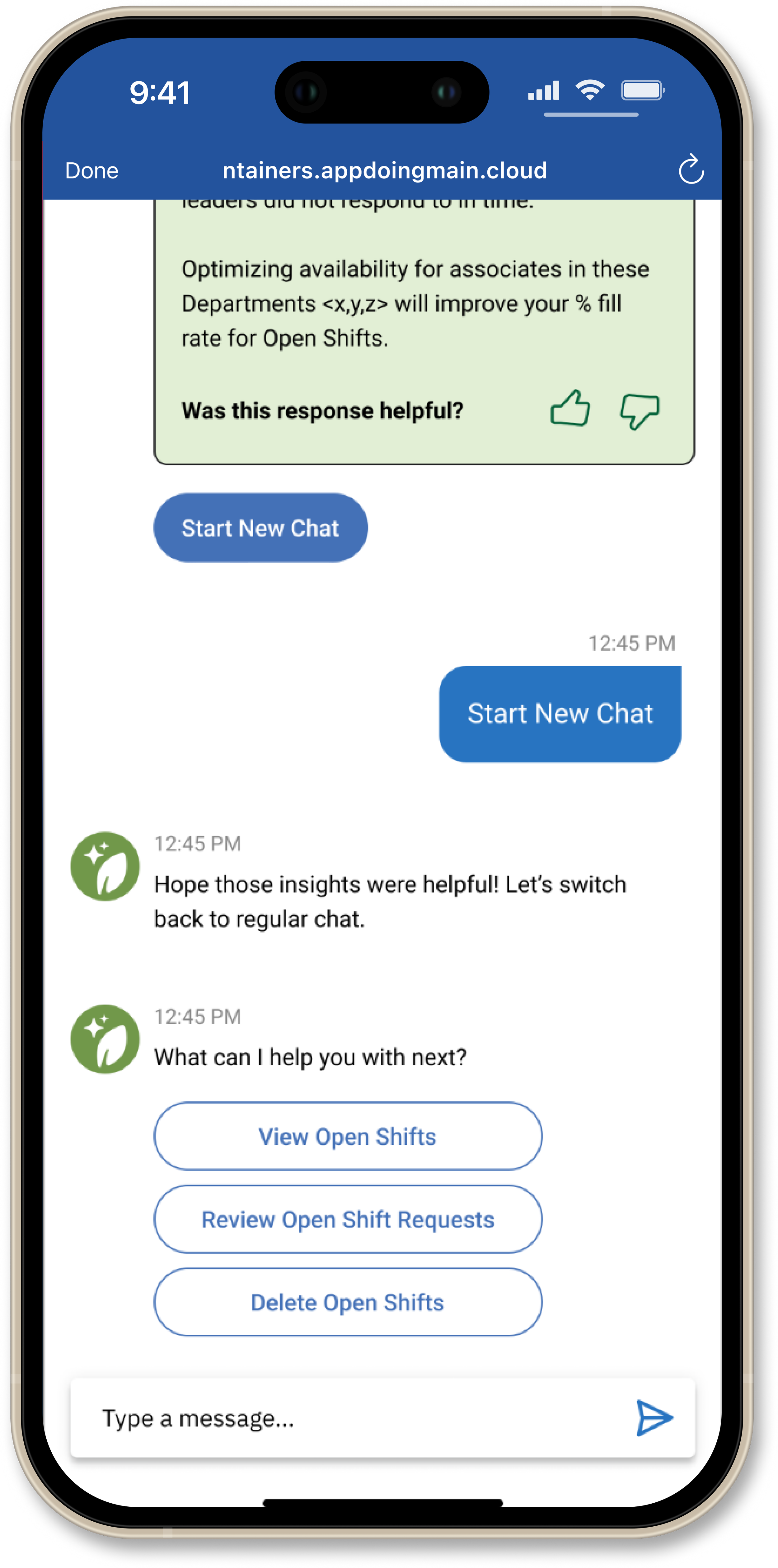
Start a new chat
To exit Sage Data Insights the “Start New Chat” button can be used and signals to the user that they have returned to the regular Sage experience.
The AI component no longer appears and the normal text box returns.

Learnings & outcomes
This data feature is now being piloted at three Kroger- affiliated stores.
One my biggest takeaways from this project is a better understanding of the underlying technology behind the product and how it can impact design feasibility.
Due to time constraints, while I was on this team, we did not have time to do any user testing, but this is something that I would advocate for is doing testing before development.